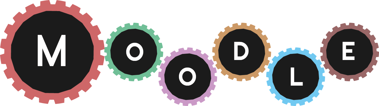
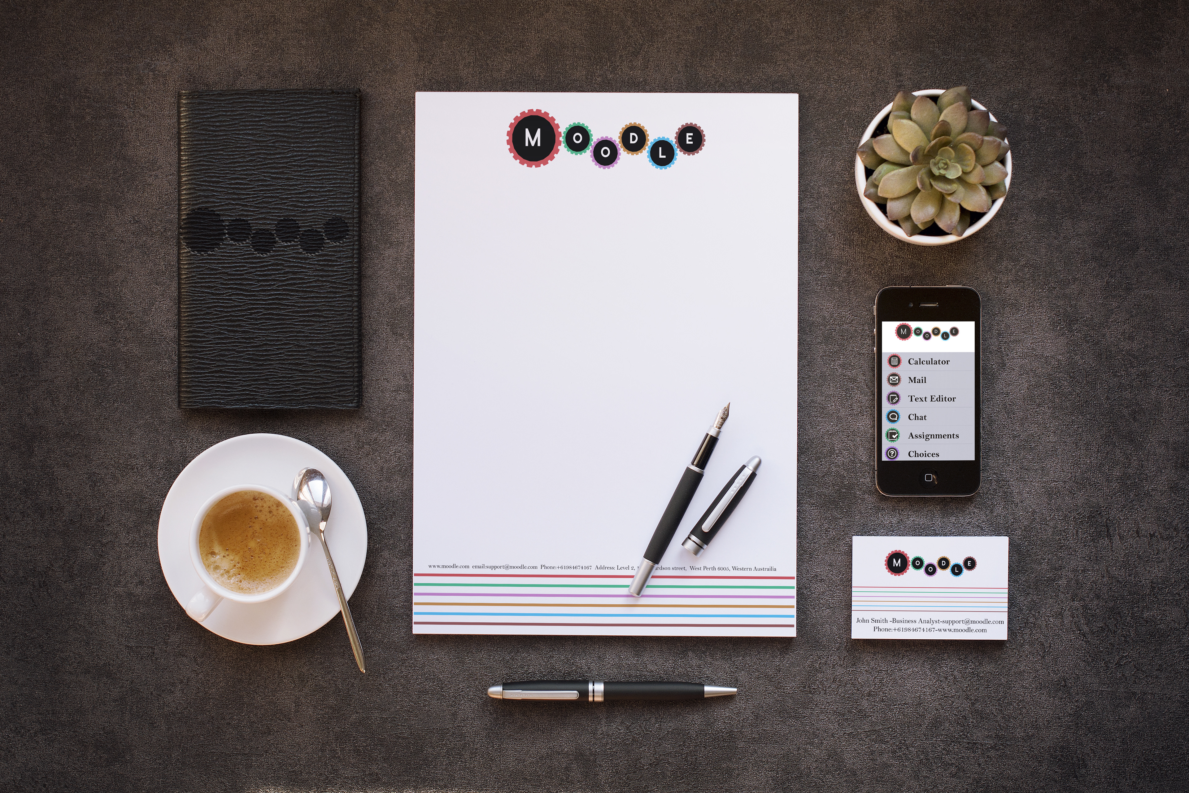
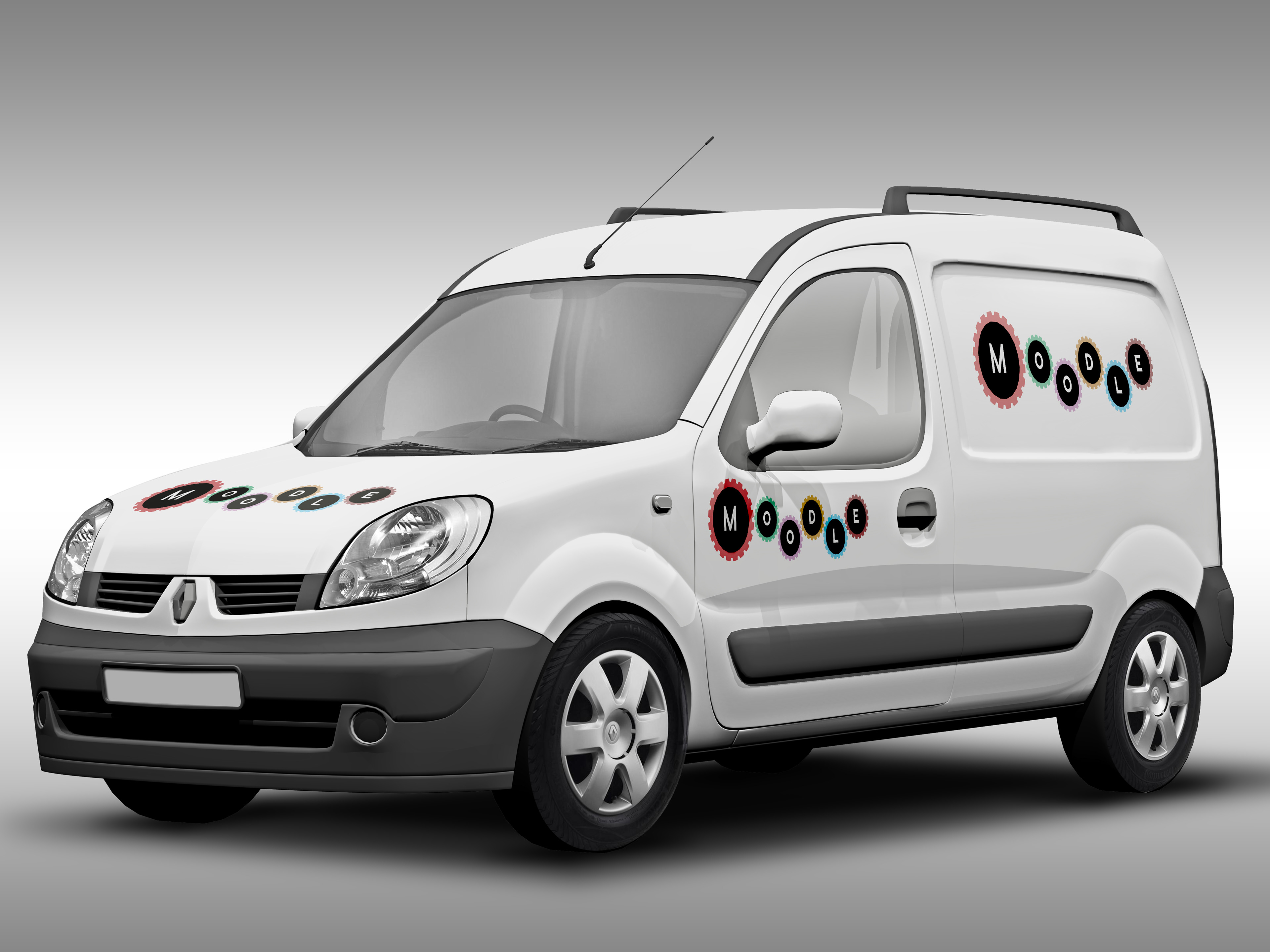
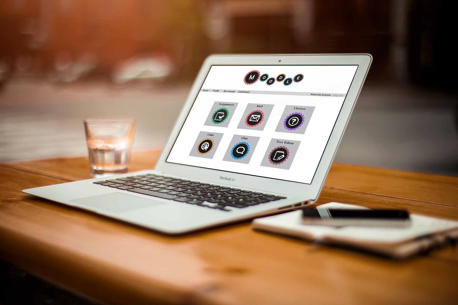
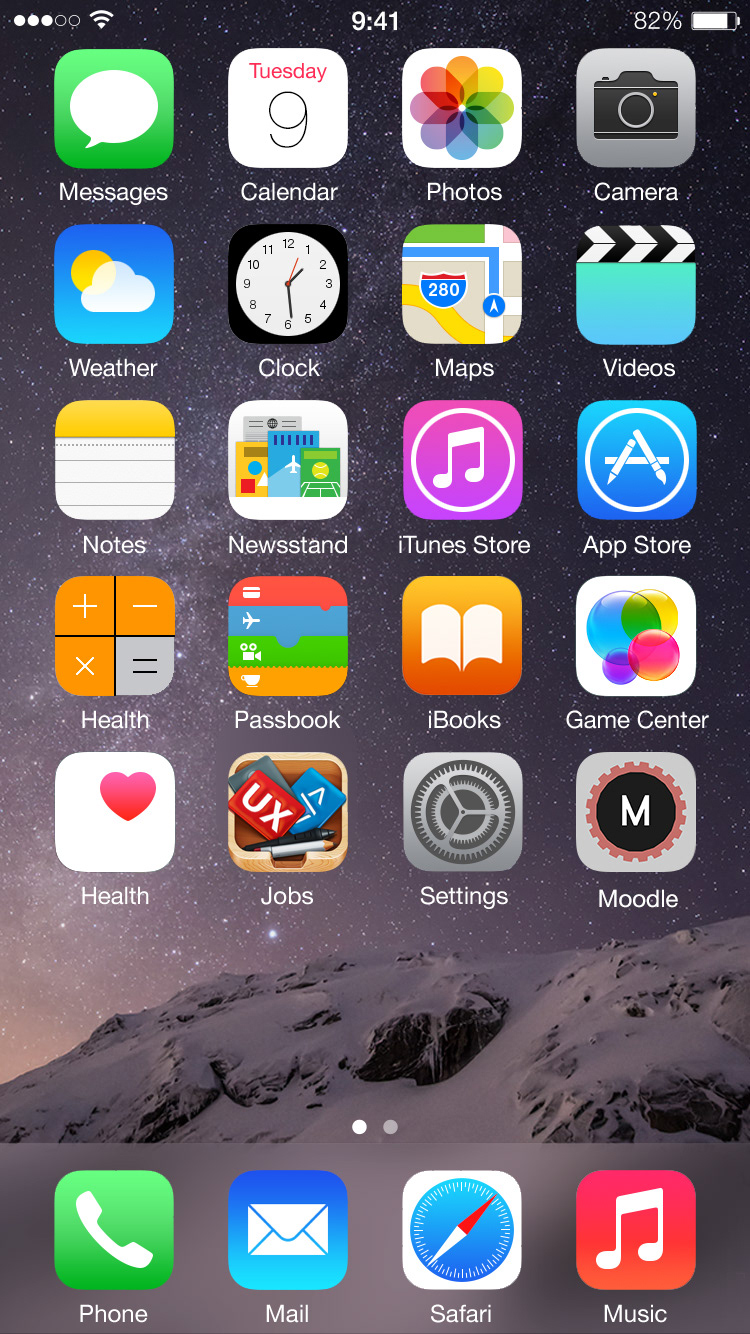
This is a proposed branding redesign for Moodle as part of a college project. The current logo has a graduation cap as part of the logo but charities and some organisations also use the software. I wanted to create a logo that would appeal to children in schools but would also be suitable to represent businesses and charities that use the software. The cogs represent machine cogs but also the idea of brain cogs. It is colourful but in a way that won't be overly stimulating if you were using the software for a large portion of the day. The website home page and app page were intended to be customisable. You can add plugins to Moodle and each organisation can have a different setup of home pages so I wanted something that was easy to understand. I thought they could have an app where you can pick a cog colour and pick an appropiate icons when people were creating new plugins etc.