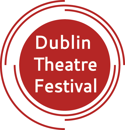
This was a college project where we were asked to update the logo and branding for an Irish company, organisation from a list given to us. I chose Dublin Theatre Festival which has been running for many years. The idea for the logo developed from the idea of an amphitheatre. The lines around the circle represent the seats around a stage. At the same time, the placement gives a sense of movement. Here the logo is shown with white text on a red background. Red is a colour that can be seen in many theatre buildings and theatre curtains.
The logo for the Dublin Theatre festival is changed every few years, usually when a new sponsorship is formed. In the past, when the same logo has been used for a few years, sometimes it is the colour that has changed so that the branding for each year is a bit different. This is what I thought could happen with this logo and branding- the main colour could be red this year, orange the following year, blue the next year and so on.
We were asked to create the image for the website homepage. At the time of creating this image, the actual website of the festival looked a bit cluttered although it has since been updated and feels easier to navigate. Some of the links were on the homepage several times. I wanted to simplify the website and also add a calendar app that would allow the user to see what is on in the festival on a specific day. I used the circular lines from the logo with the picture links to help keep a cohesive feel between logo and website.
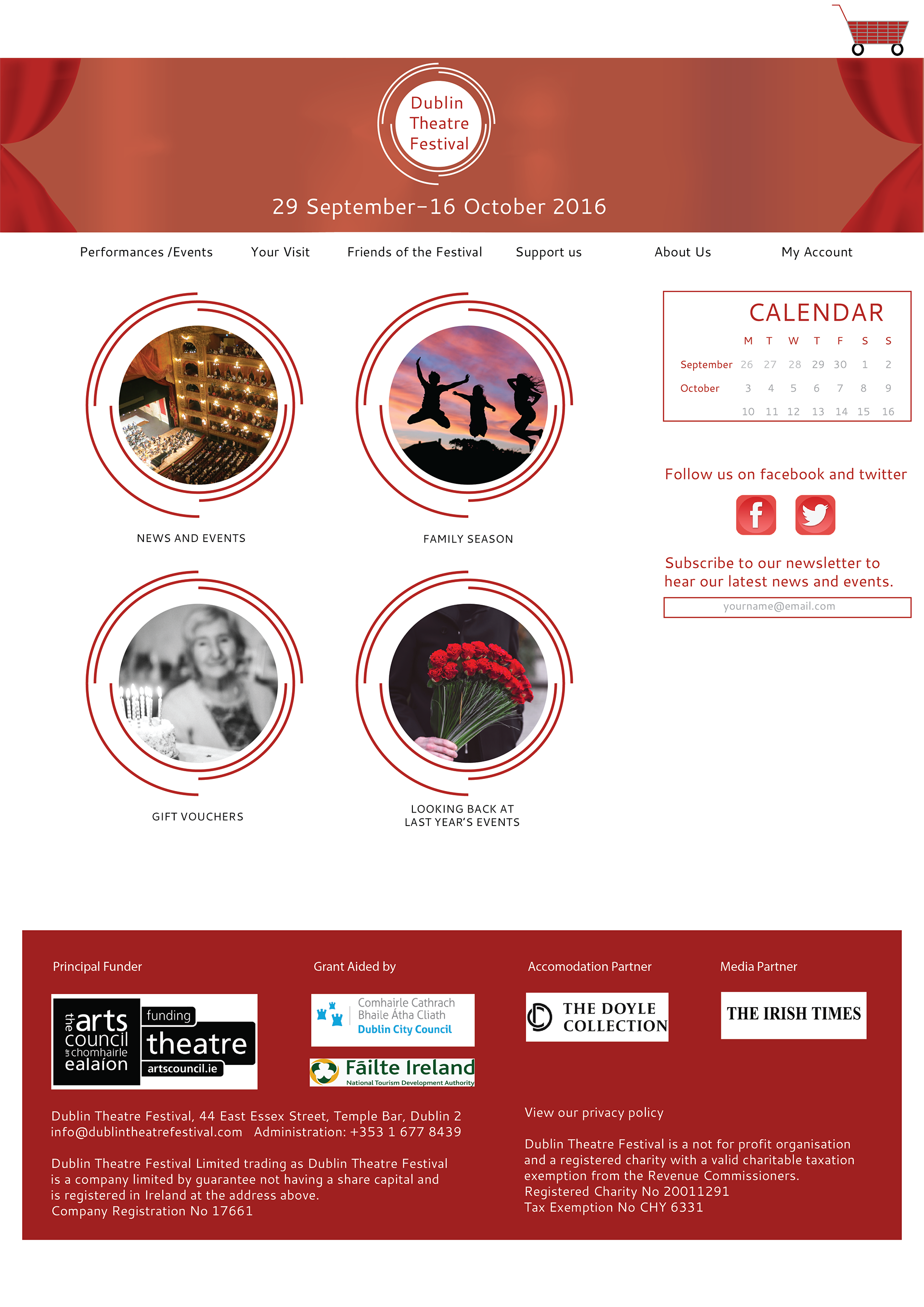
The image of the website shows theatre curtains which reflects the setting of the festival. This can also be seen in the poster below.

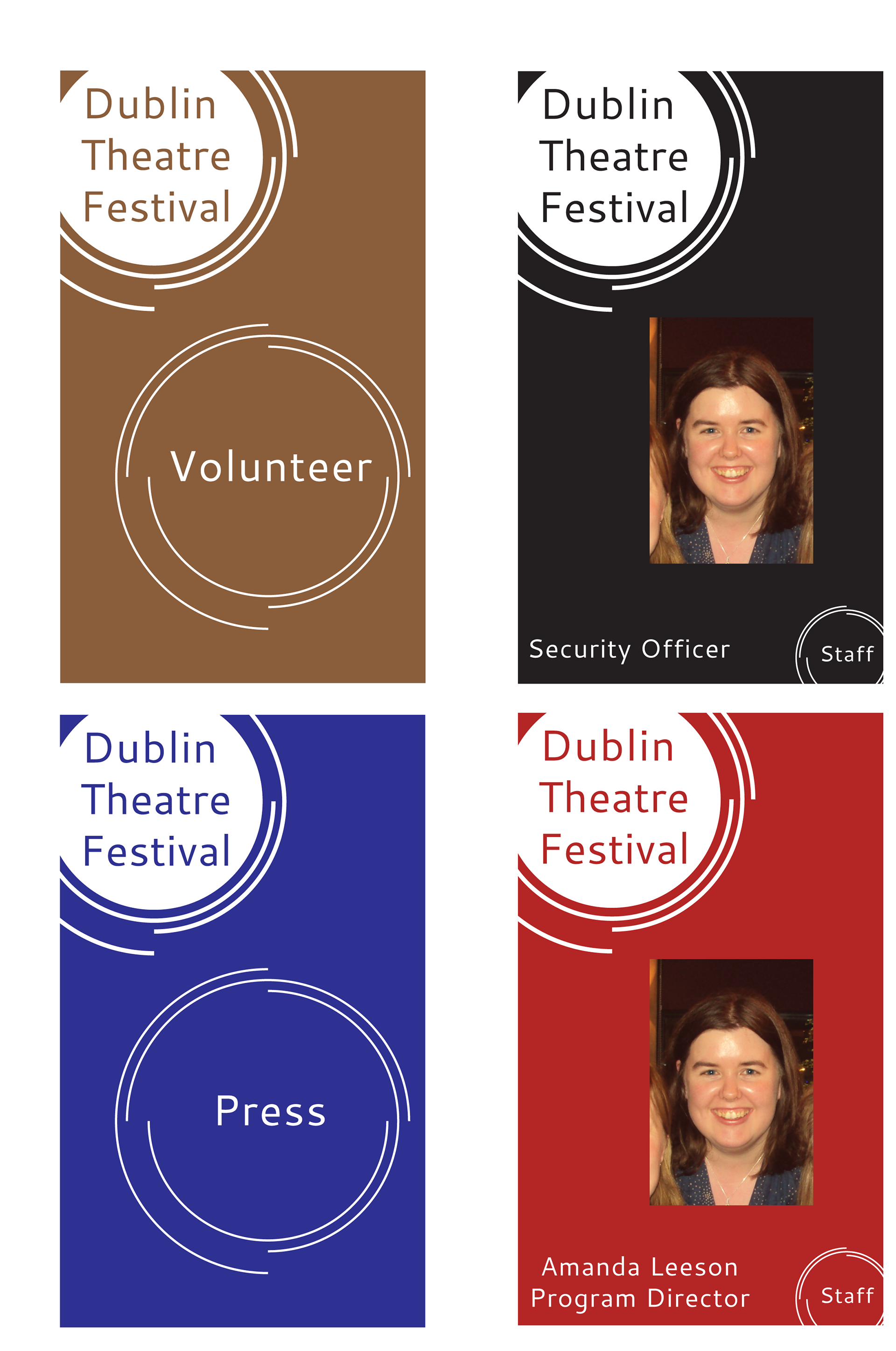
Staff ids are sometimes needed at festivals. Some roles might need photo id while others don't. I created id cards that would be worn in laminated pouches on a lanyard. The cards would be colour coded to the different areas that might need them.
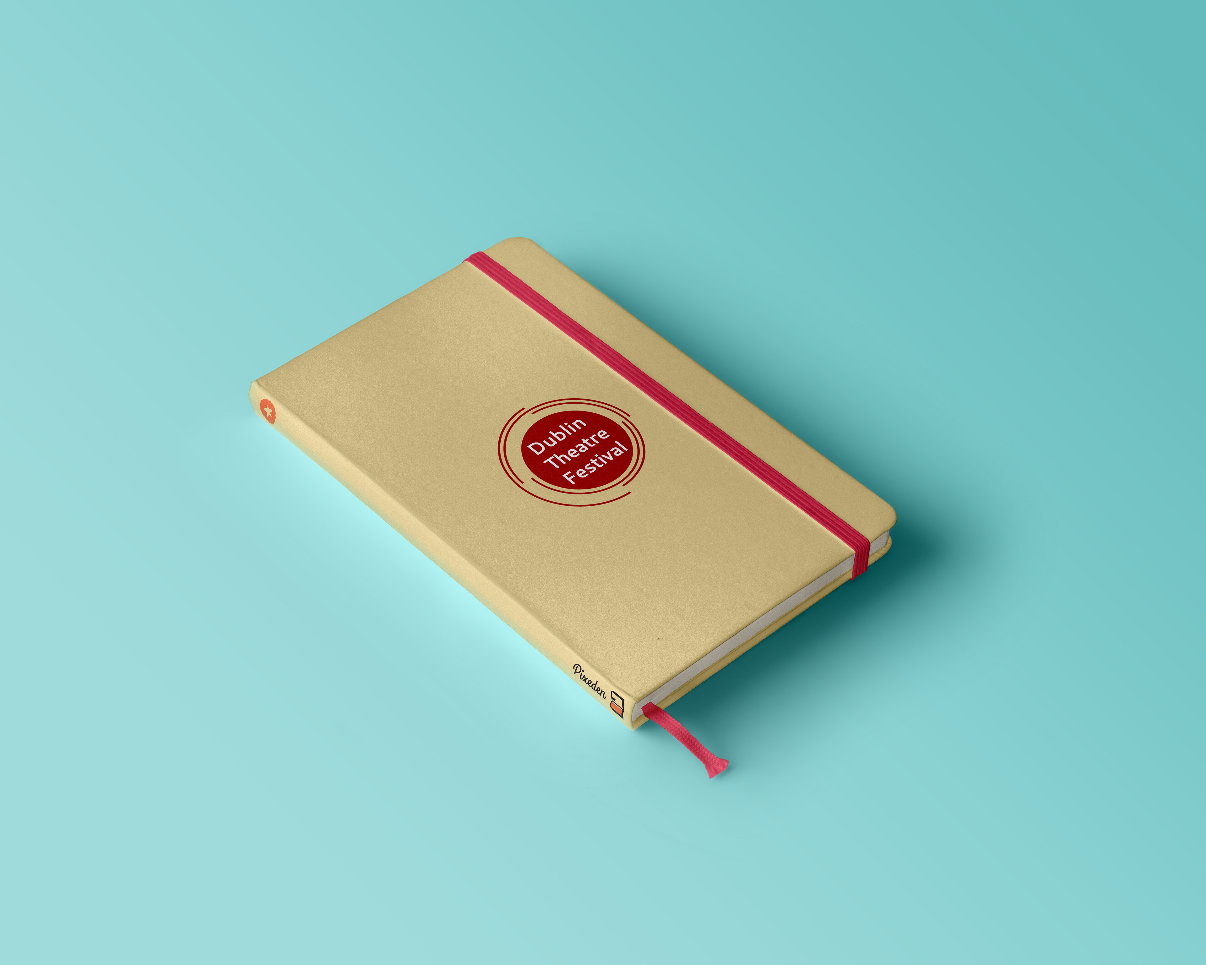
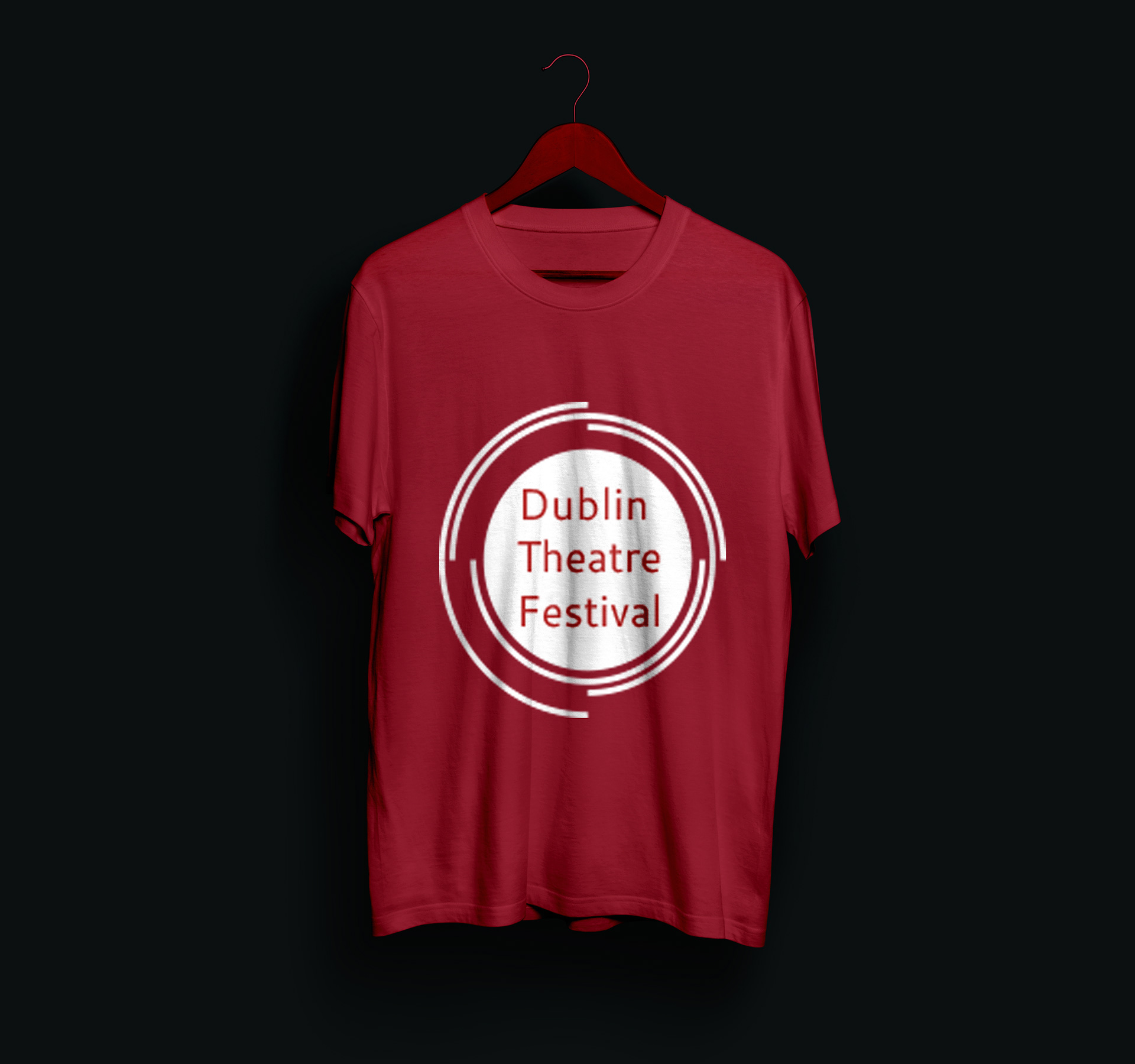
I also created a few mockups of other items that might be used or sold during the festival.